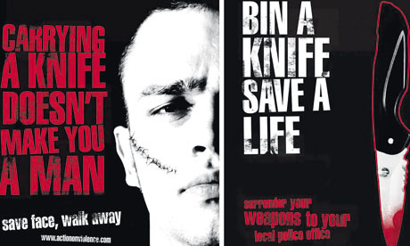
This is what i found...

Very simple design but very effective. The catchy slogan goes hand in hand with the image and would make any possible knife handler think twice about walking the streets with a knife.
Using black and white also adds to the simple quality of the poster.
Peoples ideologies about the red written slogan: made them associate it with blood.
I asked, 'What do you think about this poster campaigning against knife crime?'
(anonymously) they answered: "I think it's pretty clever but also simple which makes you appreciate it more"

This poster is MUCH more graphic, which would make more of an impact in that sense however, didn't prove as effective as some of the other posters..
I asked 'How effective do you think this poster is campaigning against knife crime?'
They answered: "Your shocked when you first see it, and quite disgusted. but once you get over the shock of seeing such a gross image it just becomes a bit of a joke, which is completely not what it is meant to do"

This poster is absaloutly vile! And completely makes you think about the dangers of using a knife as a weapon- unlike the previous poster, this image is not so extreme therefore, has no reason to be turned into a joke. The big lettering makes the message of the poster stand out a lot more than if it was done in a small font.
I asked 'How effective is this poster is campaigning against knife crime?'
They answered "I think it's very good and actually made me grab my wrists when i first saw it. It gives a very clear message aswell".
Other posters i looked at for research...


No comments:
Post a Comment